Howdy!
Thank you very much for getting a
regular license based in Büro Template
This file will help you to start working with your new Premium HTML5 Template. First steps installing, guides to create your own pages, portfolio views or any other feature included.
If you have any doubt about some detail explained in this guide or any other, just create a support ticket. We will try to help you as better as possible. Support Forum →
Notice
Please, before asking for help, make sure you are using the last template version.
1. First steps
The first we must talk about is how to work with any HTML5 template.
Package contents
- Main files — This folder contains the main files you must install in your server in order to set up your site. Check this section.
- Sketch Files — Contains all the .sketch files well grouped in layers to help you to customize visually your new portfolio in a very easy way. These files are only available for Sketch App, actually an exclusive Mac app. You could use some online app like Figma to import and work with the files in any system, this service is browser based.
- Documentation — Inside this folder you will find this same documentation updated with the last changes.
Requirements
This is not mandatory, but we deeply encourage you to work in your local machine with MAMP and Codekit, if you work with Mac, WAMP (Windows) or XAMPP (Linux). These tools are basic in order to have a work toolset for your local machine. Mostly they are mandatory when working with PHP files.
If you never tried before these tools, Youtube is full of videos about how to set up such environments. No worries, it is really easy.
If you don´t want to install nothing, you just need to open index.html with your favorite browser and start editing any template file with your prefered code editor, it´s that easy :)
1.1. How to start adding your own contents
The best will be to choose a folder in your machine to start editing your files. Preferably, as we talked previously, add your site folder into your local server installation (MAMP, Codekit...). Although you can work in any folder in your machine.
You will need a code editor in order to customize and add you own contents. In this sense I deeply suggest you to use Sublime Text. You have many different options in the market, but this one, in my opinion, is the best for newbies & advanced users.
1.1.1. Files & folders
Main files
- index.html is the main file you need to run your site in the most web servers. They use to be configured to run by default index.html, index.htm, home.html, default.html or something similar. This file contains the main portfolio page.
- index-col-0n.html are the different pages to represent other portfolio configurations, basically they display other grid configurations showing different columns and filtering effects. In earlier template versions you have two different filtering effects (scale enabled - scale disabled)
- single-project.html is the one that created to add your project details.
- about-*.html are different files to show different layouts and ideas to help you create your own about page. With team areas, services and many other template elements.
- blog.html is the file where you can find the blog cover elements
- single-post-*.html are related to the different post pages configurations. Displaying the sidebar in the left & righ side, an alternative layout...
- contact.html is the one created to show your contact details, add a map or any other content related to your business.
Folders
- api - This folder contains configuration files for your Twitter feed. We´ll cover this later in these docs.
- css - Here you will find the main style sheets (CSS/styles) for your site.
- fonts - As Büro uses different icons font based, these are the dependency files. This folder is not responsible about your main typographic fonts. We´ll cover this later.
- images - By default, the main folder where you will add your images. You can order them in different folder inside.
- inc - Here you have the different portfolio pages. As the portfolio uses infinite scroll, this method uses a technology to load different pages without doing new http requests and without reloading the page. This is AJAX techonology based. Each time that the portfolio displays 'Loading more projects' it is loading these pages. So if you want to add more pages, you just need to add more pages within this folder following the code and file naming you have here (2.html, 3.html, n.html...)
- js - In this folder are the files with all the javescript involved with the template.
- php - Here you will find the only files written in PHP. These are the ones that will process the contact form and the newsletter form. We´ll cover the form configuration later as well.
1.1.2. Upload your files to your server via FTP
- Using your FTP client, for example Filezilla, log into your server via FTP and search or create your site folder. Normally it will be at the root in your server, depending on your configuration. This is the most common way to publish a website and make it accesible online for everybody.
2. Adding Content
Basically you just need to edit the files with your preferred code editor.
In order to work with the content presentation, you can add different classes to help you to modify and style better your titles and contents in general. In the next steps we are covering the different choices you have for this.
Bootstrap
As you know, Büro is a bootstrap HTML5 template, so you will have access to the most part of the features included with the framework
2.1. Grid
This is the most important part of the theme in order to create your own layouts in a very easy way. Bootstrap provides a very powerful and flexible grid system that will help you to place your contents as you could need. Bootstrap provides a powerful responsive & fluid grid system that appropriately scales up to 12 columns as the device or viewport size increases.
In this sense, the best will be to direct you to the official docs in order to have an accurated detail about how the grid works. You can check this out, here.
Basically you need to have clear the difference between .container class, .row class and the different .col-* classes.
Some short brief would be creating first a container wrapper that it will include different rows depending on your design and inside this rows you will place columns depending again on your design in mind. The container wrapper can be a 'fluid' one that will adapt to the whole screen available width.
Anyways, do not worry if it is your first time with Bootstrap. It is one of the most popular frameworks for some reason, so you wil be creating your own layouts in minutes. Also, you have all the code modularized ∓ commented with the template in order to re-use it as you could need. Take it as guide or just replace the contents if you like the layouts used as demostration. Anyways, you have tons of guides in internet about how to work with Bootstrap and you always can drive us a mail or open a support ticket in case that you could have any related doubt, we´ll help you with anything (remind that we don´t provide customizations).
2.0.2. Helper classes
Aside the powerful grid system provided by Bootstrap, the template includes some helper classes that you can add to your markup in order to achieve many different results.
Global/Config classes
You can add some classes to the body element in order to achieve some things to work different.
- no-menu-hover — This class will remove the on hover main menu overlay that appears when hovering the different options in the navigation. We are talking about the big texts that appear on hover the menus. If you add this class into the body tag, you will remove this feature..
- no-fltrs-scale — By default the main portfolio page, in this case index.html, comes with fltrs-scale class in the body. This will enable the "zoom out" effect that happens when you click some filter. Just replace this class with no-fltrs-scale to remove this feature.
- cols-x — The template provides different files to display different columns for the projects grid depending on your preferences. But modifying this is so easy as changing in index.html the cols-x class number. Just add the number of columns you want to display. For example, if you want 2 columns this would look like cols-2 or if you want 5 columns, this would be cols-5. It´s that easy :)
index.html: line 129 -> class="js-ajax-holder projects cols-2"
As you can see here, it is really easy to modify.
2.2 Typography class helpers
You can modify the look for some typogrpahy elements with just a single class. Let´s see:
- highlight — Use this class when you want to highlight the text with the highlight color. We will show how to customize colors and typefaces later.
-
-
This just looks like this in the code
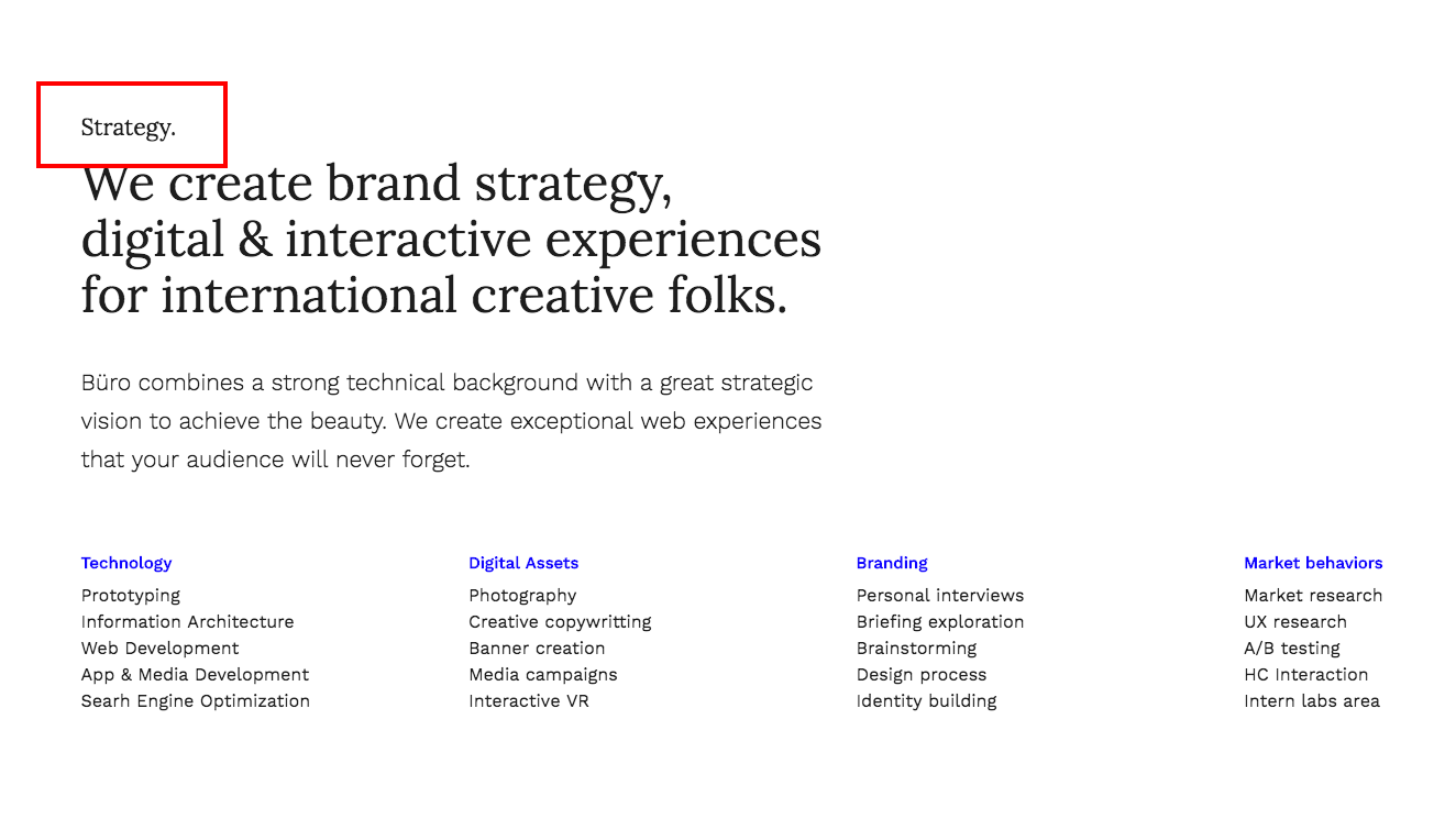
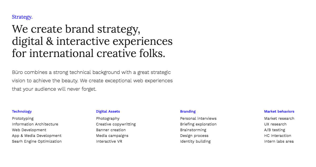
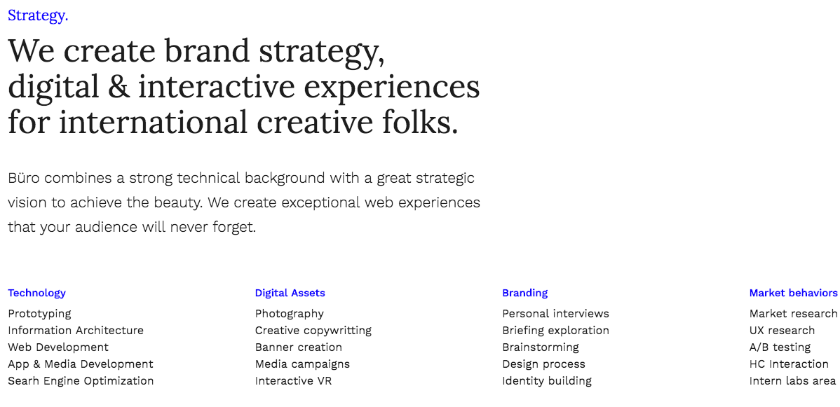
<h4>Strategy.</h4>
-
So if you want to highlight this title, just add the class in this way:
<h4 class="highlight">Strategy.</h4>
This is the result:
- claim — This class modifier will transform the text in a bigger one with the secondary typeface as base. Let´s see how this works:
-
This just looks like this in the code:
<div class="row mar-btm-sm">
	<div class="col-sm-6">
		<h4 class="highlight">Strategy.</h4>
		<p>We create brand strategy, digital & interactive experiences for international creative folks.</p>
		<p>Büro combines a strong technical background with a great strategic vision to achieve the beauty. We create exceptional web experiences that your audience will never forget.</p>
	</div>
</div>
As you can see, this is regular text and actually this just look like this:
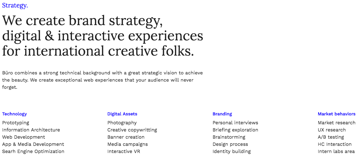
Let´s add now the claim class and let´s see what happens:
<p class="claim">We create brand strategy, digital & interactive experiences for international creative folks.</p>
- text-bigger — If you need some bigger text, you can add this class to your text. This looks like this:
<p>Büro combines a strong technical background with a great strategic vision to achieve the beauty. We create exceptional web experiences that your audience will never forget.</p>
Add the class like this:
<p class="text-bigger">Büro combines a strong technical background with a great strategic vision to achieve the beauty. We create exceptional web experiences that your audience will never forget.</p>
This results in:
<p>Developers, designers & monkeys.
We’re a very talented bunch.</p>
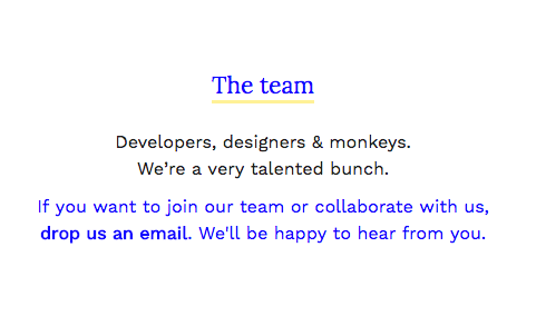
Let´s add the class:
<p class="text-middle">Developers, designers & monkeys.
We’re a very talented bunch.</p>
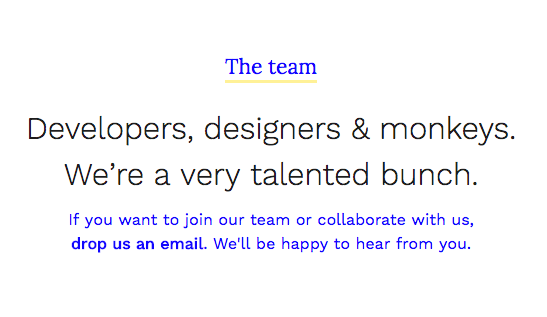
<p class="text-middle alt-font mar-top-xs">Developers, designers & monkeys.
We’re a very talented bunch.</p>
<h4 class="highlight underline">The team</h4>
2.3 Content layout helper classes
The template provides a very easy way to add margins between your block contents. You will be able to add different margins depending on your needs.
These classes are divided in two groups. The one to control the top margins in an element and the ones for controling the bottom margins. Having this into account:
- mar-top-xs — This will add a very small margin to the top.
- mar-top-sm — This will add a small margin to the top.
- mar-top-md — This will add a middle margin to the top.
- mar-top-lg — This will add a large margin to the top.
- mar-top-xlg — This will add an extra large margin to the top.
- mar-btm-xs — This will add a very small margin to the bottom.
- mar-btm-sm — This will add a small margin to the bottom.
- mar-btm-md — This will add a middle margin to the bottom.
- mar-btm-lg — This will add a large margin to the bottom.
- mar-btm-xlg — This will add an extra large margin to the bottom.
The same in case of the bottom margins:
Having this into account, you would be adding your own contents and modules and you would see this without the classes:
As you can see, no margins are applied by default, because you can control this much better with the classes with already have seen. This will give you a more accurted result to your design. And the best part is that it is responsive as well.
You can do this in many ways, but the easier one would be adding the classes to the twitter feed in this case. Now the markup is like this:
<div class="slider-module cnt-slider">
Thus, if we add the classes like this:
<div class="slider-module cnt-slider mar-top-lg mar-btm-lg">
We are adding a 'large' top margin and a large bottom margin. So now we have this :)
2.4 Forms & mail inbox configuration
You can create a compose your forms as you could need just creating the layout with bootstrap classes in a very easy way. Everything is styled and you don´t need to do much more. You just need to configure your mail inbox, where you will receive the mails from your website and the inbox for the newsletter subscribers. Also, you can custom the form process texts.
To do this, you just need to open, within php folder the files form-process.php for the main form and newsletter-process.php in case of the form related to the newsletter area. Inside you will see how to adapt these files to your needs, it is very easy.
2.5 Share options
In this section we are learning where add or remove social networks to share in.
This options are only available within single-project.html file and the blog pages. In these pages the option will be available and when the user clicks on the 'share' button, the social networks you have added will appear.
For example, if you open single-project.html, you will see around the line 227 a 'module code' with the tag 'social modal box'. As you can see, each list element is one of the available social networks. Twitter, Facebook, Pinterest, Google Plus and mail sharing. You can remove any if you want it here.
2.6 Header
As Büro is a plain HTML5 template, any change you do in your heading options, you will need to update it in every file in your site, as you know. You can use the find and replace feature in your preferred code editor in order to make this process is breath instead of going to each file, open, change, save & close.
Logo
This is the markup for the logo:
<div class="logo">
	<a href="index.html"><img src="images/logo.png" class="img-responsive" width="161" height="35" alt="Büro — design atelier"></a>
</div>
Basically you don´t need to do very much. Just add your logo path to the src attribute, in case the name is different and it is located in a different path, of course. If you are naming to your logo 'logo.png' and you have save it into the images folder, you don´t need to modify nothing here. Just remind to modify/adapt the width & height values to your logo. Also, you can add an alt text to your logo as well.
Navigation
You can set up your main navigation here. Basically you must have into account some few details in order to create your navigation
- Main navigation title. You set up this as you normally do. Let´s see this in the markup
<a href="index.html" data-title="Work" data-subtitle="Latest projects">Work</a>
<li class="active">
<a href="index.html" data-title="Work" data-subtitle="Latest projects">Work</a>
This first one it to generate the main title navigation option. You add this via data-title attribute, in this way:
<a href="index.html" data-title="Work" data-subtitle="Latest projects">Work</a>
<a href="index.html" data-title="Work" data-subtitle="Latest projects">Work</a>
<li class="active">
	<a href="index.html" data-title="Work" data-subtitle="Latest projects">Work</a>
	<ul class="dropdown-menu" role="menu">
		<li><a href="index-col-01.html" title="Portfolio page with 1 column project grid">1 Columns</a></li>
		<li><a href="index.html" title="Portfolio page with 2 columns project grid">2 Columns</a></li>
		<li><a href="index-col-03.html" title="Portfolio page with 3 columns project grid">3 Columns</a></li>
		<li><a href="index-alt.html" title="Portfolio right sided heading">Alt heading</a></li>
	</ul>
</li>
Anyways, do not worry if it is your first time writing HTML, because you have all the code writen in the files, so you will have them as a guideline. It is very easy.
2.7 Footer
The footer is created again on the bootstrap grid basis. Just check the code in order to understand how it was built.
Here you will find some social icons. As you can see in the markup the 'i' tag has a different class depending on the social network. Here are the different options you can add as class:
- icon-twitter
- icon-facebook
- icon-pinterest
- icon-behance
- icon-dribbble
- icon-github
- icon-linkedin
- icon-soundcloud
- icon-spotify
- icon-tumblr
- icon-vimeo
- icon-youtube
- icon-google
- icon-skype
- icon-whatsapp
- icon-mail
These are the different options you have in order to add your social networks icons.
Also you will need to add the link to your social network. To do this is that easy as adding your link replacing the current '#' in the href attribute in your anchor, in this way:
<li><a href="//link-to-your-network.com"><i class="icon-twitter"></i></a></li>
2.8 Twitter Feed
You can add a Twitter feed within any page. New Twitter API requires oAuth Token Key, so it's two step process
Step 1:
First, you need consumer and consumer secret keys. Get them from dev.twitter.com/apps.
Step 2:
Edit api/config.php file and replace variables with your Consumer and oAuth Keys.
// Consumer Key
define('CONSUMER_KEY', 'CONSUMER_KEY_HERE');
define('CONSUMER_SECRET', 'CONSUMER_SECRET_HERE');

// User Access Token
define('ACCESS_TOKEN', 'ACCESS_TOKEN_HERE');
define('ACCESS_SECRET', 'ACCESS_SECRET_HERE');
Your twitter feed is ready to start serving your tweets just by adding the code that you can find in about.html or about-agency.html files. Just copy and paste and play with the Bootstrap grid to fit your preferences.
3. Customization
You can customize many different details about the template with some few modifications. We are talking now about the best methods to add your own styles and how to optimize your load timings.
Hightlight colors and fonts
The main template style file is style.css, this file is within the css folder.
This file contains all the look and feel related styles and it is the responsible for the colors, typefaces, margins, spaces... Within each page head you´ll find the next related links (the main style sheets)
<!-- Main styles -->
<link rel="stylesheet" href="css/bootstrap.css">
<link rel="stylesheet" href="css/style.css">
As you can see, aside the main one, the template loads another style sheet for all the bootstrap dependencies like grids and components.
If you want to change something, for example, you want to modify the highlight color, you can do this in style.css. The whole code is well commented and you can easilly find where you must do such modifications. You will see how elements are first grouped in order to define the typeface assignment and the color scheme. Between lines 250 and 390 you have all these rules ready for you to change.
When editing templates or WP themes is not recommended to modify the core/main files, because if you do your modifications directly in style.css and you update the template in the future, you will loose all your modifications because this file will be overwritten. So, how do you should do this?
Well, you have many different approaches to this, but the more common should be creating a new css file. Something like this:
<link rel="stylesheet" href="css/bootstrap.css">
<link rel="stylesheet" href="css/style.css">
<link rel="stylesheet" href="css/custom-styles.css">
As you can see, a new css line has been added. In this file you would add you own custom rules. You can copy and paste from the original file all the rules you could need and then add your own values. Or directly create your own.
The best tool to help you editing the template when you want to modify some particular element and you want to know which styles are involved there, it´s Chrome and the Chrome Developers Tools. This toolset will allow you to inspect any web page in order to find all the styles involved, among other important details.
Thus using this tool you will find quickly any element values and you can easilly modify them in the dev tools, add your own values and then copy and paste this new rule definition into your custom style sheet, it´s that easy.
4. Optimization
When uploading your files to your server you should optimize the way they load. This will turn your site faster and faster likes to users and Google.
As we saw before, you must include in the head all the styles involved, something like this:
<link rel="stylesheet" href="css/bootstrap.css">
<link rel="stylesheet" href="css/style.css">
<link rel="stylesheet" href="css/custom-styles.css">
This is good as organization and modularity, it´s great to have control over your code but this is not optimized. The first you should do is to compress each file, for this, just copy and paste your file code in a service like this one.
This will generate a compressed file that you can use in the same way. This method just removes spaces and other unuseful characters.
This will turn your code in something like this:
<link rel="stylesheet" href="css/bootstrap-min.css">
<link rel="stylesheet" href="css/style-min.css">
<link rel="stylesheet" href="css/custom-styles-min.css">
You can rename each compresed file to something like *-min.css.
With this you have compressed and reduced the files size. This will do your site load faster but you can improve a little bit more by reducing server request. To achieve this just add all your compressed css files in a unique one. You should respect the order, because if you add your custom styles before the main styles, they won´t take effect in your site. Always respect the cascade. So at the end instead of the different style sheets you would have just one containing all the compressed code related to each one, in the same order as you had them at the beggining.
<link rel="stylesheet" href="css/your-custom-minified-ultra-optimized-styles-min.css">
Now you have your CSS ready. It´s time to pay attention to the javascript files.
They are placed at the bottom and they look like this:
<!-- Main scripts -->
<script src="js/vendor/jquery.js"></script>
<script src="js/main.js"></script>
<script src="js/plugins.js"></script>
<script src="js/bootstrap.js"></script>
Here you have all the javascript dependencies.
- jquery.js This is a javascript library for modern development.
- main.js These are the main template functions.
- plugins.js This file contains all the plugins used with the template, for example isotope.js.
- bootstrap.js Contains all the javascript dependencies related to bootstrap like sliders, mobile menus...
To optimize this is pretty the same that you did with the CSS files, you first compress the files and then you can fetch some of them. I recommend you to do this.
First compress each file, you can use this service. You should have this:
- jquery-min.js
- main-min.js
- plugins-min.js
- bootstrap-min.js
Once you have done this, you can include some file into another. For example, once you have them minified, you can add bootrstrap-min.js content at the end of the plugins-min.js. In this way you are saving another server request.
If you follow these tips and you optimize your images, your site will load faster and you will see huge improvements. Also, there are many things that you can do in your server in order to improve more your site loading times and general performance. Here you can find more tips to improve your site performance. Notice that some of them could need advanced web development skills.
Optimization
It is not mandatory to optimize your site, if you don´t want to do those steps, you just need to upload your site to your server and it will run normally. Optimization it´s just about improving user experience, save server resources and make happy users and search engines. At the end, you will be happier as well :) So go on!
5. Tips & Tricks
5.1 Make your site faster
5.1.1 Get a good hosting
You may not think that this is important, but if you want your site to display really fast you need to get a good hosting. This is the first step in having a fast site, which also translates into more views, which also translates into a better SEO, which finally translates into more sales.
There are three hosting companies which i recommend:
- Media Temple → if you want a premium WordPress hosting which is easy to manage and works pretty well, this is a good choice to host your website on.
- Siteground → this is another good hosting company, which i’m currently using to host my theme demos on. If you bought this theme you probably liked the speed as well, so I highly recommend Siteground to host your themes on (especially the Cloud VPS option).
- WPEngine → definitely not as cheap as the two examples above, but if you really want an incredibly fast website and absolutely no headaches in managing it, WPEngine is the way to go. With it you don’t have to worry about security, caching, updates, etc. Everything is handled by a great theme of professionals ready to help you with everything. You just need to care about your content.
5.1.2. Optimize images
Always optimize/compress your jpeg images before uploading them to the server. Large images should be compressed at around 90% image quality and you should also try to limit the use of lossless image files (uncompressed pngs).
Credits
And a special big THANK YOU for those great artists and creatives that provide us with some of their amazing pieces to illustrate Büro HTML5 Bootstrap Premium Template.